

Many book artists explore current social and political issues through their work. The Rollins Book Art Collection is intentionally an interdisciplinary teaching collection, directly supporting the College’s curriculum and its long tradition of liberal education. The purpose of the collection is to use art as a medium through which students can better understand multifaceted issues — global politics, economies, cultures; the tensions around social structures and marginalized populations; conflicts between human development and the environment; art as a concept, expression, and a communication tool; and other contemporary issues that students will encounter in their coursework and everyday lives.
The Rollins Book Art Collection is supported by a close collaboration between three entities on campus — The Department of Art & Art History, the Rollins Museum of Art, and the Olin Library — and is guided by an advisory board that includes students, staff, and faculty from across our campus community. It can be accessed in the Rollins College Archives and Special Collections reading room of Olin Library. The collection is also often on display in exhibitions (see a list below).
-

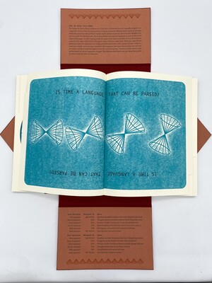
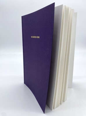
Book of Hours
Julie Chen and Keri Miki-Lani Schroeder
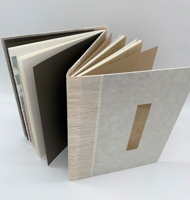
This long-distance collaboration, between California and Texas, took place during the 2020-21 pandemic. The format of Book of Hours is known as a blow book, a historical structure originally designed as a magic trick which allows the presenter to show completely different visual sequences of pages within the same book. Book of Hours contains 12 distinct sequences. The first and last sequences on each side of the book were designed by the two artists collaboratively, and the other eight sequences were designed individually by each artist. These different narratives exist concurrently within the same space and time of this book but are activated sequentially by the reader. The cone motif used throughout this book was inspired by the concept of the light cone which in general and special relativity denotes a single point in space and time.
-

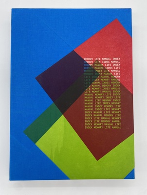
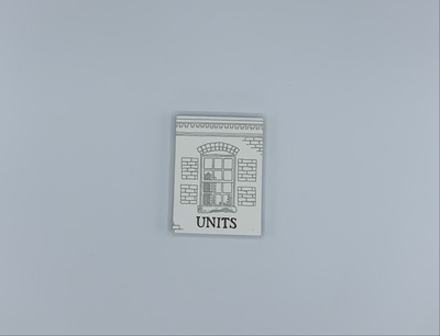
Memory Life Manual Index
Aaron CoHick, Tricia Treacy, and Denise Bookwalter
Colophon: "Life: A User's Manual, by Georges Perec + drawings based on objects from the novel + lists of memories and former homes + lists of objects on kitchen tables + drawings based on lists + wood 'type' blocks of the generated text and images x a gridded press bed x improvisational composition x 2015 - 2021 / numerous interruptions."
Wikipedia (1/10/2023): "Life: A User's Manual (the original title is ‘La Vie mode d'emploi’) is Georges Perec's most famous novel, published in 1978 ... ‘ La Vie mode d'emploi’ is a tapestry of interwoven stories and ideas as well as literary and historical allusions, based on the lives of the inhabitants of a fictitious Parisian apartment block ... It was written according to a complex plan of writing constraints, and is primarily constructed from several elements, each adding a layer of complexity. ... The content of Perec's novel was partly generated by 42 lists, each containing 10 elements (e.g. the ‘Fabrics’ list contains ten different fabrics). Perec used Graeco-Latin squares or ‘bi-squares’ to distribute these elements across the 99 chapters of the book. A bi-square is similar to a sudoku puzzle, though more complicated, as two lists of elements must be distributed across the grid."
In "Memory Life Manual Index," the creators use Perec's approach as a basis for their lists of memories and life events. These lists are in the form of one inch square blocks with words or color or image printed, it seems, randomly across each page. The result is at once stimulating and puzzling, frustrating and revealing.
-

Inked
Elsi Vasdal Ellis
Inked by Elsi Vasdal Ellis is an artists book layered with rich, colors. Inside, the pages have a circle cut out of them to see through to the other page's different color schemes and designs. One of the circular cutouts from a brighter yellow and green page, sits on top of the title page contrasting the darker blues and greens and a bit of brown of the title page. However, the title of the book does not appear on the outside title page and does not appear until the 3rd page where it was stamped on and bleeds through to the other side. The pages colors are slightly dull but range in intensity as some are brighter colors and some colors appear almost burnt. While the pages are flat and untextured, the pages look as if they have. a texture created from using crayons. As one flips through the book, lines and shapes appear on the pages. All are very angular and they break up the pages from being all the same shade of color. Some lines are thinner while some are thicker and make the pages look like they have cracks in them.
-

Inked
Elsi Vassdal Ellis
"Inked" by Elsi Vassdal Ellis is an artist's book layered with rich colors. Inside, circle cutouts allow the reader to see through to the other pages' different color schemes and designs. The pages' colors range in intensity, as some are brighter and some appear almost burnt. While the physical pages are flat and untextured, they have ample visual texture. As one flips through the book, lines and shapes break up the colors and shades, making the pages appear as if they are cracked. Overall, the book is an abstract, experimental celebration of the richness of color and texture that ink can create.
-

Black Panther Party Stamp Book
Kyle Goen
Black Panther Party Stamp Book is a 25-page (excluding photography accreditation pages) unbounded book contained within a blue clamshell cover by Kyle Goen. The Black Panther Party was a black political and civil rights organization that emerged out of the civil rights movements of the mid-1900’s that advocated for black justice and exposed police violence. On the outside of the front cover is a screen-printed black panther. Inside the covers there are newspaper-style text and images screen-printed outlining the platform issues of the Black Panther Party, a tribute to the founding member, The 25 pages themselves contain a different photograph (printed in either black or black and red) repeated 20 times on each with perforations around each image. This emulates traditional stamp books utilized by average people to mail items in the US postal system.
-

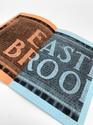
Kompendium 42
Åse Eg Jørgensen
In the New York City subway the station names on platform walls are integrated in the walls and 'set' with tiles and mosaics.
A station can have names in the eldest style — colorful mosaic set in a typeface close to Bookmann. It is an artisan's work with delicate variations, and the small ceramic pins follow the curves of the letters with great care. When the station has been expanded and the platforms prolonged, the new names have got the typography of its time. It might be cut out from standard-tiles (numbers 59 and 42), the typeface here looks like Helvetica. The big, decorative number is accompanied by smaller tiles with the same number. Number 42 is accompanied by older, typographic tiles designed by Squire J. Vickers in a typeface, adapted to the square, that bears resemblance to Copperplate with the characteristic small serifs. The colours are white on blackish blue and the blue background leaks a bit of blue into the white number or letter. A nice detail.
This type of tiles are used in many station names (Court SQ, Nostrand, Hoyt etc.) together with mosaics in a sans serif typeface (14TH and partly visible in Flushing). This typeface is more geometrical but still adapts nicely and variated to size, space and curves, e.g. the lifted TH in 14TH.
-

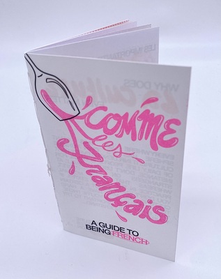
Comme les Français: A Guide to Being French
Meredith Miele
"Comme les Français" is a risograph zine outlining French slang, cultural norms, and common stereotypes.
"Understanding culture, on top of language, is the way to truly open your mind. It builds connection and compassion for others. This is where the idea of this zine series was born. A perfect marriage of my passion for French and graphic design.
"When something in a title is contained within an oval, it is a French word. If anything needs translating, the English equivalent will be listed directly underneath it in smaller point size, all-caps, and colored one of the accent colors. A similar system is also used for pronunciations." — Meredith Miele
-

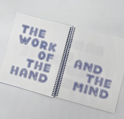
The Work of the Hand and the Mind
Kate Morrell
THE WORK OF THE HAND AND THE MIND is in-part a typeface specimen, a visual poetry exercise and a drawing manual. It presents two variations of a display typeface: CIRC, developed using a technical drawing stencil. This exercise in hand-drawn type connects the poetic and typographic through elliptical, fragmented texts.
THE WORK OF THE HAND... formed from the artist’s research within the photographic 'archive' and business records at Eks Skolens Trykkeri (Ex School Printing), a worker-run print co-operative in Copenhagen. Eks Skolens was founded in the late 1960s as an experimental art school and exists in the same building today, operating now as a commercial offset printer – THE WORK OF THE HAND... is printed on their litho press. The book joins constellations of research touching upon: the acceleration and resistance of late 20th century digital technologies, primitive word processors (IBM), the divisions of time and labour and of collective working.
The die-cut cover functions as a drawing stencil and readers are invited to put CIRC into use – duplication and dissemination are encouraged. THE WORK OF THE HAND... looks towards artists’ self publishing for ways to connect and circulate ideas in printed form, during a period in which immaterial and digital circulation is the default.
CIRC uses Mudejar display type by Jean Larcher as a skeleton for the alphabet, adapted and reworked with a drawing stencil and the addition of glyphs.
-

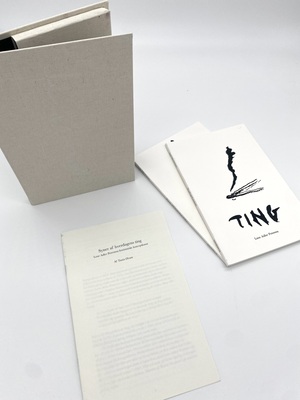
Syner af hverdagens ting
Lene Adler Petersen and Tania Ørum
Box set containing a pamphlet-bound essay titled "Syner af hverdagens ting: Lene Adler Petersens feministiske konceptkunst" by Tania Orum, and two softcover books titled "Ting" and "Opsatser" by Lene Adler Petersen. Written in Danish.
-

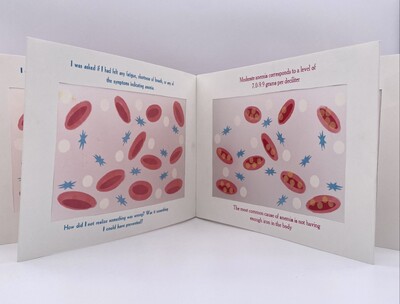
In the Blood, In the Mind
Claudia Prado
"Illness is something that can happen unexpectedly and abruptly. Whether it be because society and our education system has not sought to teach and educate us enough about the variety of illnesses/disorders out there and how we might recognize the signs/symptoms or we do not consider the value in monitoring our health unless sickness does come, this book explores both as it educates about anemia and narrates my personal mental processing of when I was diagnosed with the condition. The structure of the book contains ‘windows’ with transparent paper whose simplistic yet vibrant imagery magnifies the way anemia works in the bloodstream progressively while the text informs on the matter, mirroring how I learned more about what was going on in my body, then narrating how my mind processed it. Illness in many cases is also something whose primary effect on us is physical, but what many disregard is how those same conditions can affect someone mentally. It causes one to face new limits on what you can do, question how you take care of yourself, and feel stressed or concerned about treatment outcomes and the future. Things such as illness can happen in life unexpected, which can take a mental toll on the mind in addition to what it is physically doing to the body, but as said in the last statement of the book, 'Try not to dwell on the what ifs, just focus on what can be done now.' This is both a reminder to myself and other dealing with illness to not be stuck on the past in how things could have been dealt with or what could have been done to prevent things from happening, but what we might do to help ourselves and others as I do now with my book to create awareness and bring up questions on how society deals with illness as a whole; educationally and medically." — Claudia Prado
-

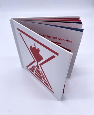
The Center for Post-Capitalist History's Field Guide to Embodied Archiving
Leah Sandler
The Center for Post-Capitalist History invites you to consider your own body and subjectivity in relation to the writing of history. As a field guide, this publication has a goal of helping you identify your own body as a valuable archive of information. Through this process, your body-archive reveals inconsistencies between Capitalism’s promises of infinite progress and the reality of the unsustainable and destructive nature inherent in its systems of production.
-

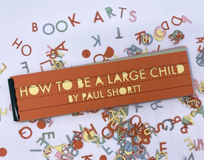
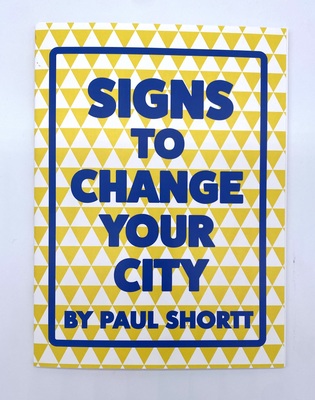
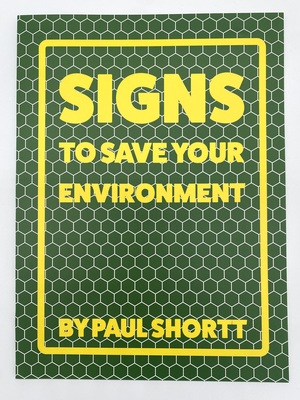
Signs to Save Your Environment
Paul Shortt
"'Signs to Save Your Environment' presents 18 sign-based prints that can be ripped out and left around your community to create change in your environment. The book is printed on 100% post consumer waste paper that is unbleached (so no chlorine was used to make it a brighter white). So as eco friendly as I can possibly be while making a book." — Paul Shortt
Each page is perforated at the top to be easily ripped out so each 8x10" sign can be framed using a standard frame size.
Paul Shortt stole his first and only street sign at sixteen after attempting to do a donut in his car and winding up in a ditch. Since that time, he has focused on making art projects with signs he designs and creates himself.
-

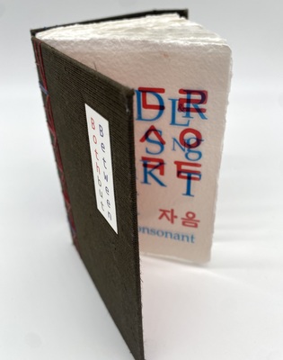
Both but Between
Jana Sim
"This book attempts to intersect two languages and comes in the form of an alphabet book using Hangul and English.
"The Korean alphabet Hangul consists of at least one consonant and one vowel to make a syllable which forms one character.
"Words have been selected that reflect my identity. I used the English alphabet but employed the structure of Hangul. By reflecting the Korean letter form and combing the two languages, this book opens a window for an English-speaking person into my struggle with a foreign language.
"The Korean font used in this book is 'Hunmin Jeongeum', which is the original name for Hangul. The English font is 'Book Antiqua'." — Jana Sim
-

Both But Between
Jana Sim
Both but Between is an alphabet book which celebrates bilingualism. A Korean American book artist, Jana Sim overlays the Korean alphabet, Hangul, with the English alphabet to draw contrasts and parallels between the two languages. The English text is printed in blue ink, on sheets of clear OHP film; underneath, the Korean text is printed in red ink on handmade paper. When viewed together, the English translation is placed directly above the corresponding Hangul characters. When the OHP film is lifted, however, the Korean can be viewed alone. This gives the impression that even when a bilingual speaker, like Sim, communicates in English, their first language is ever-present underneath. The handmade paper which holds the Korean text adds a personal touch which contributes to the underlying theme of identity. According to Sim, "Words have been selected that reflect my identity. I used the English alphabet but employed the structure of Hangul. By reflecting the Korean letter form and combing the two languages, this book opens a window for an English-speaking person into my struggle with a foreign language.” The pages are bound between two hard board covers which, when closed, are secured with a magnet. The binding is sewn with interwoven red and blue waxed thread.
-

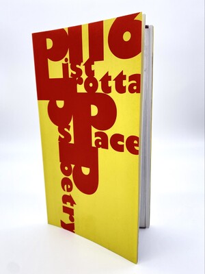
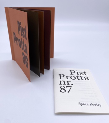
Pist Protta 116
Space Poetry
50th anniversary issue.
According to the plan, we were to come out with Pist Protta no. 70 here at the beginning of 2011, which in that case would have marked the art journal's 30th birthday, since it has been published continuously since the spring of 1981. At the editorial office, however, we have decided to deviate from the plan, and change the order a little, as we broadcast Pist Protta no. 116 from the year 2031, which, as you know, is 20 years in the future. We are therefore already marking the art journal's 50th birthday, which is a unique, long-standing achievement that no other art journal can match.
-

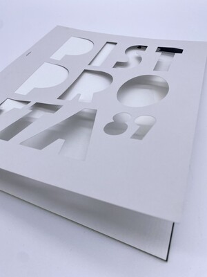
Pist Protta 89
Space Poetry
Someone will probably consider the new Pist Protta 89 a perfect example of the zeitgeist: It seems unusually design-elitist and delicious, while at the same time being devoid of content. There is basically nothing but blank paper, which is also full of holes and absences.
But we have no doubt that, in all its simplicity, it appeals to the general population. Because there are no agreed-upon, intellectualizing texts, and it can all be experienced here and now with a pair of ordinary eyes in all its concrete paper tactility.
In addition, the magazine can be read equally well on one side as the other, there is nothing that is up or down, it is very easy to deal with.
We have sought out the printer, where we have found old, used-up punching tools in the scrap box, which we have revitalized in a new artistic context. Perhaps some of the die-cuts have previously been used for well-known and important works of art, we do not know, but now they appear here again in a completely new role, that of the art journal. It's sustainable recycling!
It is actually also a counterpart to one of our old issues, Pist Protta 24 from 1994, where we explored the printer's set box and used all the typographic accessories in the form of lines, frames, borders and vignettes for a graphic artwork in his own right.
Although the new Pist Protta 89 is quite empty, because we have endeavored to completely avoid printing ink, space has nevertheless been found for a single printed image. There really isn't much to say about it, other than that it manifests a proud moment in the history of the Danish foreign service that no one wants to remember anymore.
And then we must not fail to note that Pist Protta turns 40 here in 2021, and the new Pist Protta 89 is thus a delicious appetizer for the big anniversary publication, Pist Protta 90, which is just around the corner.
-

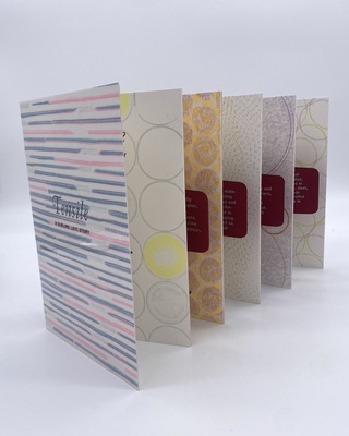
Tensile: A Sublime Love Story
Jessica Spring
Tensile: A Sublime Love Story weaves together a 19th century poem of seduction by Percy Bysshe Shelley, with current research on bisphenol contamination in our environment and bodies gathered by biologist Alyce DeMarais. Used to manufacture plastics and resins for food and drink packaging, bisphenol impacts the endocrine system, impairing development and reproductive health with transgenerational effects. 19th century writers didn’t know synthetic plastic would emerge in 1907 to change the world. In the midst of industrialization, Romantic era poets reinvigorated a spiritual connection to nature by portraying the Sublime. Shelley’s “Love’s Philosophy” celebrates the mingling of rivers and oceans as scientists conclude that exposure to bisphenol contamination is ubiquitous. Illustrations were printed directly from single-use plastics (including bread-bag ties, milk bottle caps, drinking straws and contact lens containers) to create sublime landscapes, and explore the irony of our love affair with this monster of our own creation.
-

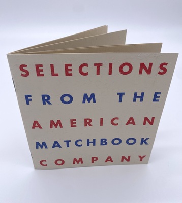
Selections From The American Matchbook Company
Ryan Standfest
Selections from the American Matchbook Company, is a ten page pamphlet style book by Ryan Standfest. The pages are an off white with red and blue patriotic colors, the cover has large text of the title in altering colors between the navy blue and red. The first page is a description of the content of the book, "Sixteen matchbook paintings selected from a series of fifty." Each page holds a risogrpah image of a monochrome matchbook, each with a different message, satirical take on government, or sociatal norms. Each matchbook is numbered on the bottom, ranging in order and from ten to fifty, flipping through the book the reader gets a viewing of deceit, lies, and control from the government and different hyerarchies. This work comments on America's class system, policing, and captitlistic greed all through small matchbooks of altering color on each page.
-

Selections from the American Matchbook Company
Ryan Standfest
Sixteen matchbook paintings selected from a series of fifty completed between January 2021 and September 2021. Printed by Cache Printing Services.
"Selections from the American Matchbook Company" is a pamphlet-style book by Ryan Standfest. Each page holds a risograph image of a monochrome matchbook, containing a different message or satirical take on government and societal norms. This work comments on America's class system, policing, and capitalistic greed.
-

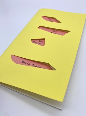
The Toe, The Horse, The Sister
Maria Zahle
A new book of visual poetry by artist Maria Zahle. This collection of 25 poems are a response to life as an artist, mother, sister, daughter and lover.
The poems oscillate between lived experience and formal experimentation, described through memories and intimate speculations. The poetry shape-shifts between words and visual marks: insistent groupings of punctuation, drawn shapes and repeating patterns. Each page is a tactile space, with language and image vibrating in tension with each other. This sculptural poetry encourages an active reader.
Many of the poems reflect on small but vivid events retold and refracted through language. The book is not a linear narrative, but rather an exploration of the ways in which experience and memory collide, fragment and overlap within our consciousness. Throughout our lives, we all exist as a range of selves, taking on various roles – child, adult, artist, friend, stranger. In Zahle’s poems, these selves are present all at once. There is no boundary between a memory, a touch, a word, a thought.
-

Side Effects May Include But Are Not Limited to the Following
Karen Zimmermann
"This book is a response to a two-year dive into the world of mental illness, the healthcare system, and the pharmaceutical system that one learns to navigate in a mental health crisis. The profound affects of a serious mental illness are staggering. This is a book about the fine print.
"For Heather. All text mined from the internet — always full of information some accurate, some not."
-

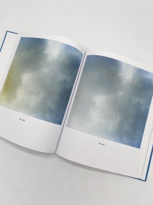
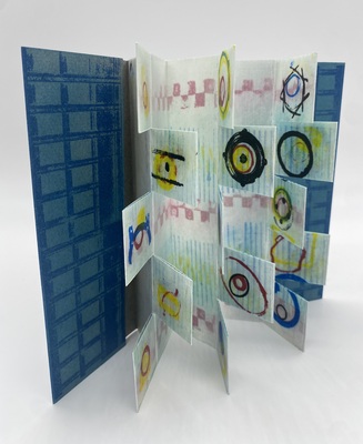
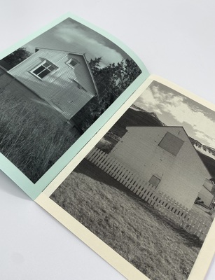
Cloud Behavior
Nanna Debois Buhl
Nanna Debois Buhl’s artist’s book Cloud Behavior is a study of clouds through photographs and drawings, essays, and interviews. During summer 2018, Buhl photographed clouds on medium-format film and experimented with the images in the darkroom. Buhl’s cloud photographs connect to historical thinking about clouds, to scientific research on cloud behaviour, and to the mystical and meteorological contemplation of clouds by August Strindberg.
Today, climate researchers study cloud behavior to understand how global warming affects the movements of clouds and how, conversely, the movements of clouds might affect global warming. Strindberg and climate researchers share an interest in reading signs and omens in the clouds—and do so with the aid of photography and other means of visualization.
This connection is unfolded in various ways in the texts of the book: In a text collage by Ida Marie Hede and Nanna Debois Buhl, three fictive characters photograph clouds and speculate about their movements. In their essays, philosopher Dehlia Hannah and literary scholar Andrea Fjordside Pontoppidan connect Nanna Debois Buhl’s cloud studies with philosophical, scientific and literary contemplations of clouds. And in a conversation between physicist Jan Olaf Härter and Nanna Debois Buhl, they discuss thunderclouds and their possible impact on the future climate. The texts are accompanied by pencil drawings, computer simulations and mythological depictions of clouds. Cloud Behavior thus forms a polyphonic narrative of clouds across disciplines and time periods.
Realized with generous support from the Novo Nordisk Foundation, the New Carlsberg Foundation and the Beckett Foundation.
-

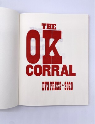
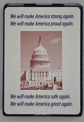
The OK Corral
Elsi Vassdal Ellis
"The OK Corral" has 54 pages in total, 46 of which include woodcut-type prints in bold red ink. The book is sewn and board-bound, giving it a strong structure. The covers are red with text printed on top in a slightly darker red ink, portraying negative, even violent verbs like “obstruct” and “collude.” The extended colophon is a sheet of paper matching one of the pages in the book with negative descriptors such as “vile” and “wrathful”; on the back of the sheet is an in-depth description of how the book was made.
While the content of the book does not specifically mention politics, "The OK Corral" clearly makes a statement about the followers of Trump and his administration. The book highlights the negative behavior that has come to be considered acceptable through the normalization of that behavior through Trump's actions, along with the negative ideologies perpetuated by his followers.
-

Pure Mobile VS. Dolce Vita
Monika Fryčová
In 2013, Monika Fryčová drove by scooter from Iceland to Portugal and then back again. She brought Icelandic bacalhau to Portugal and took Portugese batata-doce back to Iceland. Her extraordinary journey through Europe is documented in this book.
-

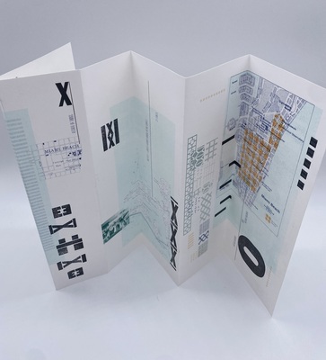
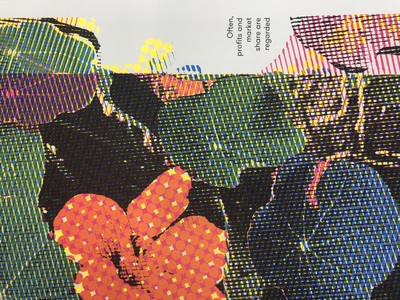
Miami Beach: A State of Things
Ashley Fuchs
"'Miami Beach: A State of Things' is an artist book that explores the future environmental impacts on Miami Beach through Risograph and Letterpress printing.
"The book is folded in varying dimensions to create unique compositional moments—allowing viewers to see the whole or see individual scenes within the book. The visuals are inspired by architecture details like the MacArthur Causeway Bridge, historic maps, and images of events in Miami Beach. These are depicted with compositions of wood type letterforms, to help portray climate change’s potential and drastic impact on Miami Beach’s historical community." — Tipping Point, Mid America Print Council
Minimal but powerful text discusses the growth and importance of the city’s infrastructure throughout history and more importantly, the fear that it might not last much longer. The front panel, stating “evacuation routes may vanish under the ocean in an emergency,” shows the growing threat of global warming on the city of Miami Beach. The strategic use of orange accents and bold black type, work in the idea of urgency surrounding what needs to be done in order to combat the continuous rise in water levels and to prevent the loss of the wonders of Miami Beach to the detriments of climate change and inundation.
