

Kompendium 42
Loading...
Description
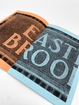
In the New York City subway the station names on platform walls are integrated in the walls and 'set' with tiles and mosaics.
A station can have names in the eldest style — colorful mosaic set in a typeface close to Bookmann. It is an artisan's work with delicate variations, and the small ceramic pins follow the curves of the letters with great care. When the station has been expanded and the platforms prolonged, the new names have got the typography of its time. It might be cut out from standard-tiles (numbers 59 and 42), the typeface here looks like Helvetica. The big, decorative number is accompanied by smaller tiles with the same number. Number 42 is accompanied by older, typographic tiles designed by Squire J. Vickers in a typeface, adapted to the square, that bears resemblance to Copperplate with the characteristic small serifs. The colours are white on blackish blue and the blue background leaks a bit of blue into the white number or letter. A nice detail.
This type of tiles are used in many station names (Court SQ, Nostrand, Hoyt etc.) together with mosaics in a sans serif typeface (14TH and partly visible in Flushing). This typeface is more geometrical but still adapts nicely and variated to size, space and curves, e.g. the lifted TH in 14TH.
Publisher
Forlaget Space Poetry
Subject
New York, architecture, design, Danish, zine
Extent
24 pages. 15x21 cm.
Style
N/A
Material
Colored grid paper.
Technique
Digitally printed. Pamphlet bound.
Date
2021
Recommended Citation
Jørgensen, Åse Eg, "Kompendium 42" (2021). Rollins College Book Arts Collection. 70.
https://scholarship.rollins.edu/book_arts/70

Other Information
ISBN 978-87-7603-222-7. For more information, visit https://www.spacepoetry.dk/vare/kompendium-42-new-york-city-subway-tiles/.