Many book artists explore current social and political issues through their work. The Rollins Book Art Collection is intentionally an interdisciplinary teaching collection, directly supporting the College’s curriculum and its long tradition of liberal education. The purpose of the collection is to use art as a medium through which students can better understand multifaceted issues — global politics, economies, cultures; the tensions around social structures and marginalized populations; conflicts between human development and the environment; art as a concept, expression, and a communication tool; and other contemporary issues that students will encounter in their coursework and everyday lives.
The Rollins Book Art Collection is supported by a close collaboration between three entities on campus — The Department of Art & Art History, the Rollins Museum of Art, and the Olin Library — and is guided by an advisory board that includes students, staff, and faculty from across our campus community. It can be accessed in the Rollins College Archives and Special Collections reading room of Olin Library. The collection is also often on display in exhibitions (see a list below).
-
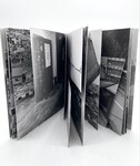
Pist Protta 75
Space Poetry
This time, the editors have been working with scissors and knives themselves - and under the influence of the general dystopia of the outside world, it has become a veritable do-it-yourself disaster.
No text except in the press release, which includes an extract from a hitherto unpublished conversation between Gordon Matta-Clark and Michael Crichton from around 1973. The conversation has been translated by Jacob Lillemose.
-
52
Karen Zimmermann
"52 Fifty-two (52) is a book created to define my identity through places, people, personal and historical events within a book structure. On the year of my fifty-second birthday I found myself with a group of friends exploring Robert Smithson's Spiral Jetty in Utah. We each made a pact to make a book. I decided, that the book would be about where I was and where I had been. I also reflected on the significance of the number (52) and its implications. It is a narrative as the book is sequenced through the years. All family lineage is broken and the percents are touched upon as my daughter could be 52/48% Caucasian/Nuxalk (a North West Canadian Aboriginal group). This measuring, like counting, is abstract. How I deal with the subject is through an abstract narrative using collage, also a metaphor for so many countless things." — Karen Zimmermann
-

Why You Can’t Get Married: An Unwedding Album
Nava Atlas
"This limited edition artist’s book examines the issue of same-sex marriage through the lens of the past. The very arguments used to oppose interracial marriage in generations past have been recycled for use against same-sex marriage. Comparing state codes, legal opinions, public hearings, and political pronouncements, it becomes apparent that the arguments aren’t just similar, but nearly identical. The book ends with Mildred Loving’s statement on the 40th anniversary of the 1967 Supreme Court decision, Loving vs. Virginia, which legalized interracial marriage in all fifty states. She stated in part, 'I believe all Americans, no matter their race, no matter their sexual orientation, should have [the] freedom to marry.' The Unwedding Album’s prettiness stands in stark contrast to the ugliness of the language of bias framed within, a reminder that there’s still a way to go to before the right to marry by same-sex couples is a given. As even in the wake of the 2015 Supreme Court decision legalizing same-sex marriage in all fifty states, continued efforts to roll it back with 'religious freedom' laws make it clear that universal acceptance is not yet at hand." - Nava Atlas
-
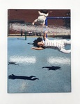
The Presence of their Absence
Miriam Schaer
This 90 page, full color, hard cover artist book explores society's prejudice against women without children, using original photography, research and the artist's writings.
-
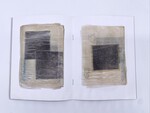
Hestebogen
Myne Søe-Pedersens
An artist book containing images of negatives found in a photographic archive. As time has passed they have become glued together and are now bundled up in layers of transparent paper. On several of the negatives is written ’Hestebogen’ (’The Horsebook’), hence the title of the artist book. Kasimir Malevich’s work Black Square from 1915 is a huge inspiration to the work. The black square was the ‘zero of form’; a space for projections of feelings and associations.
-
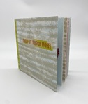
From Right to Left
Wendy Fernstrum
"From Right to Left is an artist book about the effects of changing one's dominant hand. Through the personal narrative, I tell the story of why and how I switched from my right to my left as my dominant hand. I wrote this narrative using both my right and left hands, then scanned the handwriting, made photopolymer plates, and printed it letterpress.
"Other text in the book describes the use of the right and left hands in our culture and explains the effects in the brain of changing dominant hands.[On pages 9 and 10] I drew the two neurons using my left hand, then scanned the drawings, made plates, and printed them letterpress. The background neuron was drawn dot by dot and screenprinted.
"This is the first artist book where I combined both screenprinting and letterpress printing. ... [Pages 13 and 14] shows a book within a book. The small book was letterpress printed using text excerpted from Light on Life, a book about yoga by B.K.S. Iyengar. The text explains the need for balance between the right and the left sides of the body. The small book is sewn into the drumleaf binding used for the larger book." — Wendy Fernstrum
-
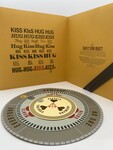
Subject/Verb/Object
Ellen Knudson
Subject / Verb / Object is a word game that grew from a need to process feelings of anger. The game has no beginning, no end, and no way to win. The turning, fitting, and order of words can lead to clarity or confusion. The reader plays with language and considers some of the options about what we all want, need, and have.
The concept behind the book stems from the frustration and anger I feel towards art criticism and other academic writing. Academic language seems intended to control its audience, exclude "outsiders", and is not meant to clarify the subject for a reader. It takes the beauty and passion out of language and, in turn, out of people. Subject/Verb/Object pokes at this idea by doing something similar: it uses simplistic language and structure to force the reader to attempt a visual organization of the things we cannot put in order: our desires.
-

Ten Thousand Things, Volume No. 45
Karen Kunc
“My work as an artist/printmaker addresses issues of the landscape and our natural surroundings as direct influences from my Nebraska heritage, my daily experiences and viewpoints in the landscape of the plains and from extensive travel, and as artistic interpretation and contemplation on larger issues of the eternal life struggle, of endurance and vulnerability, growth and destruction. My prints suggest extremes of weather and natural forces at work, a sense of the micro/macrocosm, set against landscape or space, both wild and cultivated, intimate and unknowable. I am interested in the span of time it takes to wear away a canyon, build a mountain, the erosion forces that continually wash onto the plains, forming the earth, and, ultimately, shaping our world. My hope is that these larger concepts are provoked by viewing my work with a poetic and intelligent sense of wonder. My symbolic images are derived from a rich mix of instilled influences, born at home, and greatly expanded and contextualized from seeing life lived the world over, my experiences and past work, and issues in contemporary art. I recognize a host of associations that flow out of my work and are research interests for me - from nature and science, spiritual and religious thought, art historical and modern icons, immigration narratives and native myths.” - Karen Kunc
-
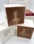
De Las Putas Confesiones (On the Professions of Strumpets)
Mado Reznik
"This book has been dreamt as a playing poem. Many years ago I traveled to the town where my mother was born looking for her story and my roots. I got acquainted with the woman who ran a Museum of Immigrants. I took several photos from an old Public Record of Prostitutes, which at the time (the early beginning of the last century) was a law, i.e., every woman that worked as prostitute had to be registered. That was made with my first digital camera.
"A couple of years later I selected some of the pictures and I wrote poems about their dreams and secret wishes. With that in mind I decided to put them names of minor Greek goddesses but for one, the very well-known Helena. I always had the idea of making a playing work. So in 2001 I set a digital movie with the pictures and the poems.
"In 2012 I went back to those faces and words and I made this artist book. This is a box with cubes. When the box is opened there is a mirror with the title for the people to see their own image. Each cube has on their sides the texts and two intaglio photogravures both on Japanese Tengujo paper and handmade paper. This superposition creates a depth effect as if it were a holographic image. There are also two velvet cubes that work as jokers or wild cards. In the end all is nothing but chance." — Mado Reznik
-
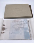
A Throw of the Dice will Never Abolish Chance (Ein Würfelwurf kann den Zufall nicht abschaffen)
Daniela Deeg and Cynthia Lollis
Inspired by a 19th century work by Stéphane Mallarmé as reinterpreted by 20th century Belgian artist Marcel Broodthaers, this project by long-time collaborators Lollis and Deeg prompts an examination of how a book’s sensory characteristics impacts the reader’s experience. Screenprinted on matte translucent pages that crinkle loudly when turned, the sequence of fragmented synonyms in English, Dutch, French and German words are layered with flattened representations of objects and spaces. Though the reader can see through overlapping text and imagery, the transparent pages create more confusion than clarity. Spreads open in unexpected ways or not at all, occasionally obscuring images printed on hidden folds. The random sequence of ideas challenges readers’ expectations about narrative structure while evoking the discomforts of tourism, feeling unable to access a real understanding of a strange place while simultaneously breathing in all the unfamiliar sights and sounds.
-
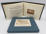
Animals in Peril: Images of Our Friends Who May Be Leaving Us
Tom Knapp
"In producing this book of images of some of my favorite animals, I hope to draw attention to their plight, and perhaps contribute in some small way to their survival. These wonderful creatures deserve and need our help if they are able to remain with us, and I am indeed grateful to all the people who dedicate their time and effort in this regard." — Tom Knapp
"Animals in Peril is an important book. It is a necessary book. And it is, even today, a timely book. Although it may be little in size, consisting of thirty original etchings by the artist, it is large in its purpose and goal. It preserves images of some of the planet's many endangered animals and it is a call to action for concerned citizens worldwide." — Jon Looney, Preface
Each etching is accompanied by biographical information of the animal illustrated. Among the animals included are Giant Panda, Galapagos Tortoise, Gavial, and Salt Water Crocodile.
-
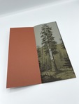
Felling the Mammoth Tree of Calaveras Country
Clifton Meador
"The Giant Sequoia of the Sierra Nevada mountains are survivors of the last period of climate change. These huge trees used to be widespread - they grew all over the continental United States. As the climate changed during the Pleistocene Epoch, their range became limited to the western slopes of the Sierra Nevada at an altitude of 3,000 to 8,000 feet. They now survive solely in groups called groves, and there are only about 70 groves left. They are among the largest living things ever to have existed on Earth: one tree in Sequoia National Park is estimated to weigh 1,800 tons.
"During the nineteenth century, California seemed like the promised land, a place where luck and gold ran in rivers. The news that humongous trees were growing in the Sierra Nevada mountains seemed like a myth, and the story was met with skepticism - assumed to be part of the hyperbole that surrounded the Gold Rush. The insistence that they were real, and enormous beyond anyone's experience, created a flurry of interest. Skeptics in the East demanded proof - tangible evidence. So, an enterprising soul decided to cut down the biggest Sequoia he could find. It happened to be a tree that Augustus T. Dowd first saw in 1852 in the Calaveras grove. Who is surprised that the first giant tree encountered by a European settler was destroyed in order to prove that it existed?" - Clifton Meador
-
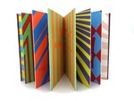
Vertigo
Amy Pirkle
"I was diagnosed with vertigo last September after a particularly bad (3-day long) episode, so this book is about the things that make me feel better whenever I am having a bout of vertigo. The colors aren't represented as well through the photographs, but I've tried to pair up colors that vibrate against each other as the reader looks through the book, to kind of replicate the dizzy feeling one gets if she has vertigo.
"I printed Vertigo at Penland School of Crafts during a week-long retreat for instructors in September 2011, shortly after having been diagnosed with vertigo. The imagery represents things that make me feel better when I am experiencing vertigo, including water, cool air, sleep, and turning off the lights." — Amy Pirkle
-

The Inner Workings of Accordions Explained
Erika Spreiser
In this art book, The Inner Workings of Accordions Explained, Erika Spreiser takes a whimsical approach to the explanation of how accordions work, noting that the sounds produced are because accordions are home to ghosts. The book is folded in accordion style — to mimic an actual accordion — with blue cloth-bound board covers. The inner pages are bordered in black and illustrated with ghosts and other figures, with text on the left-hand page of the two-page spread and the illustrations on the right. The opposite side of the accordion fold is red and illustrated with opaque, white ghost silhouettes. The book is signed and numbered edition 3 of 5 by Erika Spreiser.
-
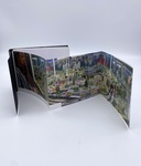
Udflugter med tog
Åse Eg Jørgensen
This installment of Space Poetry’s Udflugter series follows the Jørgensen family on a train journey to Amsterdam. Their adventure is presented as a collection of seven fold-out panoramas consisting of multiple photographs pieced together. These photographs, rather than focusing on the sweeping vistas seen out the train’s window, capture the activity (or lack thereof) of the various train stations and interiors the family inhabits while getting from one place to another. The conjoined images in combination with the book’s uniquely folded and bound form create a hybrid between a vacation photo album and a home movie.
-

Africans in America
Ben Blount
Appearing like an ordinary hardcover novel, this book details the history of Africans in America, dedicating a page for each year since 1619. Only four pages contain any actual information on the history of Africans in America. Blount uses the absence of information to make readers reflect on what is not said about African-American history.
-
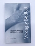
Wrongly Bodied: Documenting Transition from Female to Male
Clarissa Sligh
Wrongly Bodied relates the stories of Jake, a contemporary white male imprisoned in a woman’s body, as he transitions from female to male, and Ellen Craft, a 19th century black slave woman who escapes to Philadelphia from Georgia by passing as a white male slave owner. Working as staff support at a small woman’s college in Denton, Texas, and in the US Army reserves, Jake had been a female soldier in Operation Desert Storm in 1991. Sligh and Jake worked together over four years to document his journey. What results is a book of photographs and texts that take us inside what became a highly transformative journey for the photographed and the photographer. Includes essays by Carla Williams, Jake in Transition from Female to Male series, or, Through the Mirror and What Clarissa Found There and Silvia Roncucci, Women in Transition: From Female to Male (translated from Italian).
-
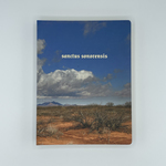
Sanctus Sonorensis
Philip Zimmermann
Sanctus Sonorensis is a 90-page board book by Philip Zimmermann with gilded edges, gold foil-text on the cover, and biblical-inspired phrases throughout. The cover image features a snapshot of the Sonoran desert in Southern Arizona about 50 miles from Lukeville, just a couple miles from the Mexican border. It is one of the most heavily trafficked and dangerous entry points for illegal Mexican immigrants entering the United States, and many die there each year from exposure and lack of water. The skyscapes throughout are all photographed in New Mexico and Arizona deserts during 2003 and 2004. The interior pages show a visual progression of sky from dawn to sunset, accompanied by a single line of text on a two-page spread. The work comments on Americans' complicated attitudes on illegal immigration from Mexico.
-
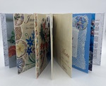
Stitches
Alex Apella
"My great-grandmother Berta, from Hungarian Transylvania, taught her four daughters to embroider; just as generations of mothers before her had learned from their mothers. As I grew up, the embroideries of my great-grandmother, along with those of my grandmother and great aunts punctuated our home, grounding those of us living in the United States in the traditions and expressions of our ancestors’ homes. Here in Argentina, where two of my great-aunts settled, and where Berta herself passed away, the homes of offspring also are enlivened with this link to our identical heritage. In the newer generations, across the continents, the ability to embroider, design, sew—the ability to express oneself—has expanded and evolved just as our grandmothers’ designs and embroideries expanded and evolved in their new homes. The stitches not only hold us to our heritage, they inspire us into our futures. All scans of original Hungarian embroideries and patterns used for the collages are from our family's personal collection, as are the family photographs." - Alex Appella
-
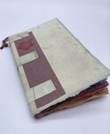
The Intrepid Ones
Brian Borchardt
From the text: "In the village of Juchitan, Mexico, gay men … are regarded as neither men nor women; they are know as muxe, and are considered a major element of society. They are a third gender, combining the best parts of both the male and female, equipped with special intellectual and artistic gifts."
The Intrepid Ones provides a glimpse of Juchitan and its tripartite society. Set in a colorful array of handmade papers that have been collaged, perforated, and punctuated by unattributed photographic transfers, the production suggests that this is more than a local history.
-
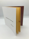
Transforming Hate - An Artist's Book
Clarissa Sligh
A golden crane gleams just inside the cover of Transforming Hate: An Artist’s Book. Although it may look like an ordinary piece of origami, there is a deep significance to the delicate, reflective material and the carefully folded flaps. The golden crane is a metaphor, bringing the topic of social justice to the eyes of the public. As a black woman, author and artist Clarissa Sligh has worked tirelessly to prompt the serious conversation of white supremacy for all Americans. The goal of Transforming Hate: An Artist’s Book was to turn hateful words of white supremacists into art. Through the process of creating her book, Sligh was painstakingly familiarized with the many levels of white supremacy and how it is widely projected into our society. In conjunction with the levels of white supremacy, are the deep layers of oppression and violence for the underrepresented races, genders, classes, and sexual orientations in America today. Sligh asks the questions: “Why do we keep each other from being who we really are?” and “How can we begin to talk about what separates us?” Transforming Hate: An Artist’s Book forces readers and viewers to think about their daily decisions in regards to who receives which rights, and who is specifically marginalized in their communities on a daily basis.
-
No Safe Levels
Lise Melhorn-Boe
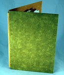
"Northern Ontario highways are lined with rock cuts, sometimes covered with graffiti. This pop-up rock cut morphs into the artist’s scarred body." - Transformer Press.
"This is a rock cut because I love the rock cuts along the highways up north. People do often put graffiti on the rock cuts, so my graffiti on this ‘rock cut’ is all the heavy metals that are in my body and the size of the lead and mercury are much bigger because I had a much higher concentration of those than say, tin. To visualize — this book is cut out in the shape of me lying down on my side, with my leg stretched out. It connects to the quote down at the bottom, which is: 'There is no separation. We are the environment. So whatever we do to the environment, we do to ourselves,' and that’s David Suzuki. So I am part of these rocks, these rocks are a part of me. This is my personal landscape and it’s my body and its intersections with the environment, with nature, with rocks, with metals." - Lise Melhorn-Boe, interview with Cassandra Kuyvenhoven from "The Garbage-loving Environmentalist," found here: http://unevenearth.org/2016/06/the-garbage-loving-environmentalist/
-
Flip Read
Heather Weston
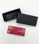
Explores the experience of lip reading. The book aims to challenge the hearing person's perceptions and assumptions about how we construct our verbal and visual world and how we make sense of the information available to us. It employs the naturally silent and yet verbal domain, as well as the variable pace that the reader can impose on the read, via the pace of the flick. The statement on the verso alludes to the idea that articulating words (in essence, turning the page more slowly) can aid in understanding (akin to a normal strategy of talking more loudly to a deaf person). The statement of the speaker is not revealed within the book, leaving a doubt in the reader's mind over whether they have understood as much as can be understood, reflecting the inexact science of lip reading. The actual spoken statement is this: "How would you cope with the volume turned off?"
-
Shedding Light
Heather Weston
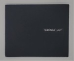
"Explores the book as a tactile object in the extreme and the importance of light and touch within the reading process. Taking away the book's usual visual narrative clues, the seeing reader is left with little traditional visual information with which to decode the presented 'text', but instead is faced with Braille text implicitly inviting them to feel the narrative. Help is provided in the form of a visual Braille alphabet card to assist readers to decipher the Braille and read the narrative that is hidden from conventional view. However, through a thorough physical exploration of the book, the reader may or may not discover a textual narrative on the reverse of the page. By shedding light through the page the book easily slips out of its felt cover and can be held up to the light, the sighted reader is given a textual translation of the Braille, emphasizing the need for light within the reading process. The ambiguous title relates to both the loss of light implied by the Braille, as well as the casting of light across the book needed for the text based reading." - Heather Weston
-
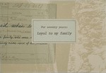
For Seventy Years: Loyal to my Family
Keiko Ishii
The third in the series of books by Ishii examining the history of family members that resided in America before, during, and right after World War II. "The back of the 3rd book, For Seventy Years: Loyal to My Family, is based on the Loyalty Test on Japanese internees during the war. This government-issued questionnaire (February 1943) was taken by all adult internees in the camps to verify that they forswear allegiance or obedience to the Japanese emperor and willing to serve in the United States military. This created a tension between the two generations; the first who were born in Japan and could not become American citizens and the second who were naturally American citizens by being born in the U.S.. The historical documents cause the viewers to imagine the complex feelings of many Japanese-Americans who lived through the era would have. The front of this book is a parallel response to the complex history on a personal level. With the questionnaire beneath the family related documents; birth certificates, area map of Tacoma, WA where they lived, midwives' names from the city directory and so on, it obscures the truth whether my family members were loyal or disloyal to the U.S. from myself as a researcher." - Keiko Ishii

