

Many book artists explore current social and political issues through their work. The Rollins Book Art Collection is intentionally an interdisciplinary teaching collection, directly supporting the College’s curriculum and its long tradition of liberal education. The purpose of the collection is to use art as a medium through which students can better understand multifaceted issues — global politics, economies, cultures; the tensions around social structures and marginalized populations; conflicts between human development and the environment; art as a concept, expression, and a communication tool; and other contemporary issues that students will encounter in their coursework and everyday lives.
The Rollins Book Art Collection is supported by a close collaboration between three entities on campus — The Department of Art & Art History, the Rollins Museum of Art, and the Olin Library — and is guided by an advisory board that includes students, staff, and faculty from across our campus community. It can be accessed in the Rollins College Archives and Special Collections reading room of Olin Library. The collection is also often on display in exhibitions (see a list below).
-

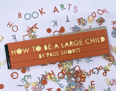
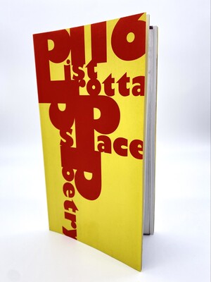
How To Be a Large Child
Paul Shortt
"Many years ago someone was talking bad about me, and called me a large child. I thought that was awesome and turned it into a whole series of photos, videos and this book. Embrace your inner large child." — Paul Shortt
-

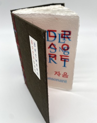
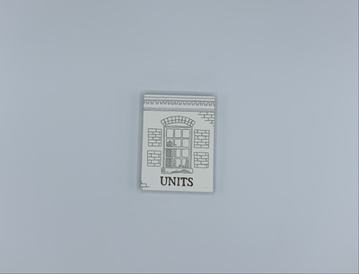
Korean Traditional Door Patterns
Jana Sim
Two books, one vertical and one horizontal, consisting of 15 bass wood pages each (including front and back cover) bound together with knotted string. Laser etching catalogs the traditional Korean door and window patterns. In the back is a laser-etched photo of the artist’s father at work on a door. The final page is a typed colophon on paper elaborating on both books and specifying that together they are edition 3 of 5.
-

Lagon Revue: No. 7: Pluie
Sammy Stein
Lagon Revue: No. 7: Pluie is a 312 page book with accompanying English-French translation booklet. It is a collaborative work exploring comics in different graphic styles. It includes works in color, black and white, and in metallic and neon inks. The work is paperback and features an exposed spine. It is a part of an anthology, and 2000 editions were printed. The cover is a collage of photography of dark blue mud or water, and a mud-covered figure over a black and white comic panel featuring finely inked plants and the lower half of a figure’s head spitting into their hands. Internally, the book is a collection of comics in disparate styles and subjects featuring both English and French.
-

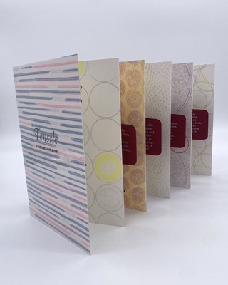
Acts of Translation
Sarah Bryant
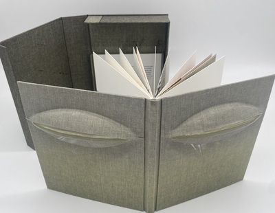
Acts of Translation is a uniquely designed book collection that offers multiple reading experiences. The binding allows readers to expand the volume and view all five books simultaneously, read two books side by side, or explore each book individually. The entire collection is bound together by a shared spine and protected within a slipcase. Each of the five sections is a distinct artistic work, featuring unique imagery and paper types. A collaborative group created these sections, with each one exploring a different 'act of translation,' which they define as 'the conversation and communication of information.' The diverse group of creators includes a photographer, a biology professor, a type designer, a soprano performer, and an elementary Spanish teacher—each bringing a unique perspective to the project." The revised text maintains the original's informative content while improving flow, providing more context, and enhancing readability. The structure now more clearly highlights the book's innovative design and the collaborative nature of its creation.
-

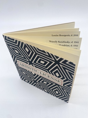
Artistic License
David Nees
"Artistic License is a celebration of those who have the true courage to be free. I have put historical artist in order of their death date. Dating the artist to their death may seem morb; however; it is meant to illustrate their lifespan, not just when they may have been famous/ influential. May these be of inspiration for our own pursuit of freedom"
-

Artistic License
David Nees
"'Artistic License' is a celebration of those who have the true courage to be free. I have put historical artists in order by their death date. Dating the artists by their death may seem morb; however; it is meant to illustrate their lifespan, not just when they may have been famous/influential. May these be of inspiration for our own pursuit of freedom." — David Nees
-

A Blessing and a Curse, The History of Menses
Erica Spitzer Rasmussen
24 page typewritten book that documents the world-wide practices and developments in the story of menstruation.
-

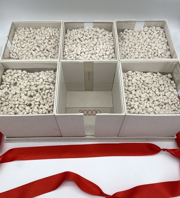
30000: A Set of Four Books
Mado Reznik
In these four bookworks Reznik recounts the violence of Argentina’s last civil-military dictatorship. She has centered her work on the 30,000 dead and disappeared.
“The danger of banalizing past state violence and forgetting its tangible, visceral realness is one that exists throughout the Southern Cone of Latin America. In an effort to revive the memory of Brazil’s military dictatorship, it is useful to look to neighboring countries and share experiences and methods for communicating collective trauma. Here, Artememoria shares Argentinian artist Mado Reznik‘s installation series entitled 30000. Here, Reznik meditates on the statistic 30,000: the symbol of the number of people disappeared because of state violence during the last civil-military dictatorship in Argentina. The number includes the 500 kidnapped children and the 5 fetuses found in the wombs of mothers who were kidnapped and killed.
“Using allegorical forms, the artist focuses on making the gravity of this number felt. She does not need to address the justifications and explanations espoused by those who negate these events — instead, she focuses on the violence itself. One can find interesting parallels when comparing this body of work to the exhibition 'Hiatus: Memory of Dictatorship Violence in Latin America', exhibited in São Paulo’s Memorial da Resistência and featured in Issue 1 of Artememoria.” — "Mado Reznik Remembers 30000" (Artememoria, published March 7, 2019)
Book 1, 30000 Nuditos: A piece made with 30000 knots made by Reznik with lamp strings. One compartment is open (with the number) because the concern about violence and genocide is always possible in many different ways. 30000 is a symbolic number because we still don't know how many people were murdered. The whole piece is designed as to be seen by any angle.
Book 2, 30000: a book with 30000 small holes and no words.
Book 3, 500: The dictatorship kidnapped 500 children most of them still today don't know their identity. Reznik used an old Spanish book ¨La voz de los niños” (The children´s voice) then put 500 knots inside. Reznik says “If you take a look to the counter cover it says that the book has been approved by the Church´s censorship. In my country part of the Roman Catholic Church helped the dictatorship.”
Book 4, Cinco (5): The anthropology forensic group discovered five fetuses in women's wombs thrown alive into the sea. The tides brought the corpses to the shore. It was possible to identify that those women were pregnant, probably the women didn't know. Reznik made an envelope looking like a bureaucratic file. She used five tea bags with lamp strings painted with red encaustic.
-

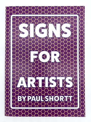
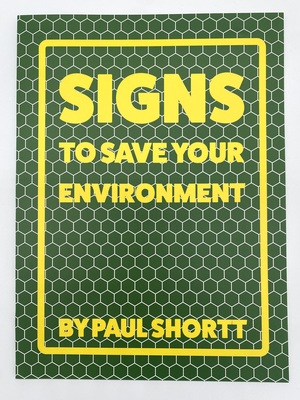
Signs for Artists
Paul Shortt
"'Signs For Artists' is a book of signs exploring the difficulties that come with being an artist. The signs are hopeful, critical and playful about the realities of the artist life. The perfect book for any artist." — Paul Shortt
Each page is perforated at the top to be easily ripped out so each 8x10" sign can be framed using a standard frame size.
Paul Shortt stole his first and only street sign at sixteen after attempting to do a donut in his car and winding up in a ditch. Since that time, he has focused on making art projects with signs he designs and creates himself.
-

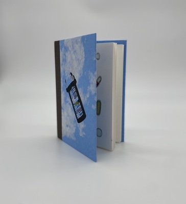
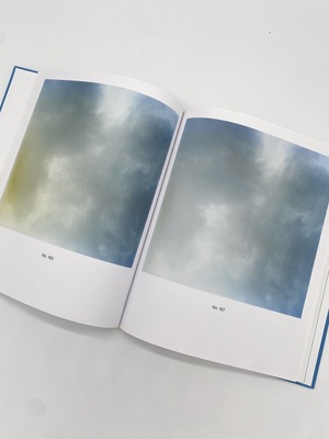
The Pocket Sky Atlas
Stephanie Wolff
The Pocket Sky Atlas by Stephanie Wolff is a carefully crafted book that begins with its design, featuring a small rectangular box that echoes the book's cover material. Upon opening, readers encounter a title page and a poignant dedication that reads "For all those who look up," setting the tone for a contemplative exploration of the sky.The interior of the book is thoughtfully designed, with monotype depictions of skies occupying the right-hand pages, accompanied by carefully selected quotes on the corresponding left pages. These quotes represent a diverse range of voices—from renowned historical figures to more obscure, everyday observers—creating a rich tapestry of human perspectives on the celestial landscape. Each sky is rendered in full bleed, using a palette limited to blue and gray, which creates a sense of simplicity and depth. The book's innovative design includes a stepped foredge, where each page is slightly shorter than the one preceding it. This clever technique allows the edges of multiple skies to be visible when the book is first opened, creating a layered visual experience. A particularly engaging feature is found at the book's conclusion: a pocket containing a volvelle. This spinning overlay reveals small, intricate portions of the sky, each meticulously matched to the interior page illustrations. This interactive element invites readers to engage more deeply with the visual narrative. Ultimately, the work is a profound meditation on the sky, celebrating humanity's enduring fascination with and appreciation of the celestial realm throughout centuries of observation and wonder.
-

Astral Projections II
Islam Aly
Astral Projections II by Islam Aly is an artistic exploration of talismanic shirts and their mystical significance. The book features seven shirts intricately illustrated with cyanotype prints, blending religious texts, sacred symbols, and seal markings. The blue-toned cyanotype process gives the shirts an ethereal quality, enhancing their spiritual connection. The covers, also designed with constellations and stars, tie the celestial to the spiritual themes in the book. The accordion binding allows the entire book to unfold, offering a full view of the shirts, creating an immersive visual experience that highlights the mysticism behind these garments.
-

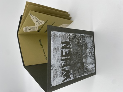
When…
Saxon Anderson
"This piece continues the theme of my trans identity. In this one I wanted to look at how I felt over the process of transitioning. The most important part of this piece is the writing, especially with the process of letterpress. The process of having to select every sort, and then after having to put all of them away, related so much to the patience that you need when transitioning. Even if you have enough money to pay for the hormones or surgery, you still are limited by time. That’s why the writing in this piece focuses on waiting and on the impact that that has on a person that has to wait to feel comfortable." — Saxon Anderson
-

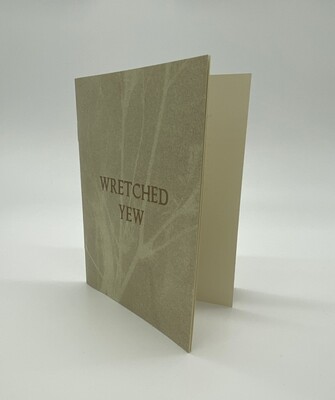
Wretched Yew
Amy Bagwell
"Its safer for everyone that I write this and not the poem bashing my sleep." — Amy Bagwell
A risograph zine containing poems by Amy Bagwell and photographs by Dawn Roe.
-

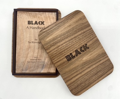
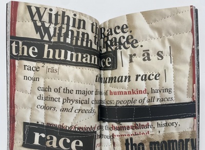
BLACK: A Handbook
Tia Blassingame
"A companion piece to 'Negroes: A Handbook' (2015), 'Colored: A Handbook' (2020), and 'African American: A Handbook,' 'Black: A Handbook' continues the artist's discussion of race while exploring paper transformation—sifting the texture, surface, color, presence of a simple piece of paper." — Primrose Press
“Despite pandemic exhaustion and varied stressors or maybe because of them, making this edition was strangely calming. This handbook was inspired by artworks, my family, nature, but above all by the strength, perseverance, audacious artistry and unparalleled creativity, dignity, humanity and journey of a people who push forward against all efforts to the contrary.” — Tia Blassingame
-

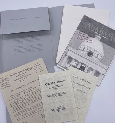
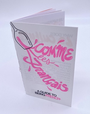
Why the South Demands Corrected Textbooks
Katharine Buckley
"In 1919 the United Confederate Veterans created a committee with the goal of influencing education to promote a version of history that would look back kindly on the Confederacy. This group, the Rutherford committee, focused its efforts on public education and newly formed state textbook commissions.
"The letter included in this artist's book is a facsimile of one the committee sent to education institutions and textbook-choosing commissions around 1920. In an effort to rid public schools of textbooks that were critical of the Confederacy, this letter was paired with a pamphlet with instructions to reject any textbook that didn't contain 'truths of Confederate history.' Altered facsimiles of this pamphlet and its successor are also included in this book.
"Now, students are required to take a year of Alabama history in fourth grade. Textbooks selected for this course have put forth white-washed versions of history. For this artist's book, pages from the textbook used by the artist as a student were selected and printed as altered facsimiles. These textbook spreads show the persisting influence of Lost Cause mythology in education and the insidious 'truths' it relies on." — Contoura Press
-

Free to Choose: A Women's Guide to Reproductive Freedom
Esther Eberhardt
46-page typewritten pamphlet zine that documents the history of underground abortions and the pro-choice movement in pre-Roe v. Wade America. It includes stories of women who went through these abortions, information on menstural extraction, resources, and a call to action to, "not go back to the bad old days".
-

Unidentified Flying Object Song
AB Gorham
Unidentified Found Object Song is a 16-page bound book housed in a drop spine book enclosure by AB Gorham. The covers feature a protruding shape covered in book cloth that reminds viewers of flying saucers or other unidentified flying objects. The book’s visuals vary from solid saturated colorful shapes to soft gradients. The text in UFO Song is fragmented and lyrical, contributing to the book’s unknown and intriguing nature. The text draws on written experiences of aliens in encounters and creates a playful space where the reader can reflect upon the idea of truth and understanding. It is through these written experiences, like the ones described throughout UFO research and within books like Allen Hynek's 'Project Blue Book', that Unidentified Found Object Song is able to create the book's enchanting atmosphere. The text and visuals come together to create a mysterious and dreamlike reading experience.
-

Unidentified Found Object Song
AB Gorham
"Unidentified Found Object Song" is a 16-page bound book housed in a drop spine book enclosure by AB Gorham. The covers feature a protruding shape covered in book cloth that reminds viewers of flying saucers or other unidentified flying objects. The book’s visuals vary from solid saturated colorful shapes to soft gradients. The text in "UFO Song" is fragmented and lyrical, contributing to the book’s unknown and intriguing nature. The text draws on written experiences of aliens in encounters and creates a playful space where the reader can reflect upon the idea of truth and understanding. It is through these written experiences, like the ones described throughout UFO research and within books like Allen Hynek's "Project Blue Book," that "Unidentified Found Object Song" is able to create the book's enchanting atmosphere. The text and visuals come together to create a mysterious and dreamlike reading experience.
"'Unidentified Found Object Song' is an artist book that draws on published documentation of unidentified flying objects (ufos) and other alien phenomenon to create a mysterious visual/reading encounter. This book exists on the edge of visual and textual logic, taking recognizable objects and elements of landscape and defamiliarizing them through digital manipulation, unexpected color combinations, and isolation from context. Each spread contains a vaguely-familiar visual mystery letterpress printed in colors from saturated reds and golds to transparent violets. There is sidewalk cheese, lenticular clouds, and a landscape of crumbs. There is reassurance that what the reader/viewer sees is in fact real. The book ends with a silver landing. The text in the book, densely lyric and fragmented, follows a through-line voice that affirms itself as Transcriptionist, Jokester, Witness. Inspired by research, including J. Allen Hynek’s 'Project Blue Book,' first-hand alien encounter documentation, and photos, diagrams and sketches from reported sightings, 'UFO Song' seeks to open up a playful space within the conversation about believability and the shifting nature of truth and understanding. This artist book posits that creating a book-art-reading experience which captures the concept of making familiar things alien could lay the groundwork for larger cultural acceptance of an individual’s distinctive, strange, real, or imagined event. Although, early written accounts, photographs, or videos of unidentified flying objects or alien encounters were often considered to be hoaxes, the real casualty of many of these encounters is the way that these events jeopardize the integrity of the individual who experienced the encounter.
"In American Western culture there seems to be a limited capacity for accepting and crediting people’s unique experiences, especially when they don’t align with the status quo. 'UFO Song' presents imagery and fragments of language in a way that challenges the reader/viewer to make connections, draw conclusions, reveling in an unfamiliar sounds and visual sequences, and maybe even expand their willingness to accept the rarest of visions as possible." — AB Gorham
-

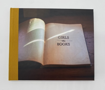
Girls Vs. Books
Sara L. Press
Defacing a library book can be seen as a subversive act of vandalism, but in Girls vs. Books, this behavior seems to be about more than just working through the boredom of youth. Through her photographs of books defaced by girls, Press captures the joy and defiance of imaginative and active female readers engaged in a dialogue with the books they are reading. Many book artists also engage in this kind of back-and-forth when they alter an existing book to create a work of art. Through the intimacy of these photographs, readers of Girls vs. Books can connect with the readers of these original titles by examining the unique marks they left behind. As Press states, these marks were made by “women who didn’t think twice about violating the sanctity of the printed page with their own editorializations. Several of the (known) defacers grew up to be writers, editors and artists themselves.”
"Girls vs. Books is an artist’s book made from my Storied Books photographic series about vernacular altered books.
"My edition echoes its subject matter: I constructed it by cutting up and rebinding commercially-printed books of my photos and then titling them with rubber stamps." — Sara L. Press
-

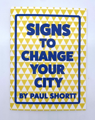
Signs to Change Your City
Paul Shortt
"Signs to Change Your City" presents 18 sign based prints that can be ripped out and left around your home or city to create change. The signs address social and infrastructure issues that effect cities, offering alternatives to the status quo. The perfect gift for the seasoned and aspiring city planner.
Each page is perforated at the top to be easily ripped out so each 8x10" sign can be framed using a standard frame size.
Paul Shortt stole his first and only street sign at sixteen after attempting to do a donut in his car and winding up in a ditch. Since that time, he has focused on making art projects with signs he designs and creates himself.
-

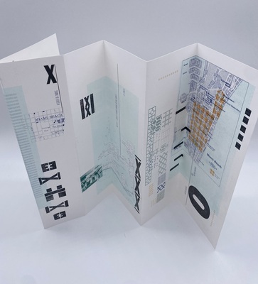
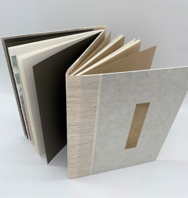
Connection: Korean Traditional Door Series
Jana Sim
In Jana Sim's Korean Traditional Door series, the artwork takes the form of a doorframe with a knocker that opens to reveal a ground-level city view, immersing the viewer in the scene. The book itself becomes the art, created as an elongated object bound using traditional Korean 5-hole binding techniques and composed of newspaper pages. These newspaper pages are intricately cut, allowing viewers to see through the open areas of each leaf, creating a layered and transparent visual experience.
-

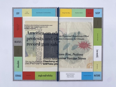
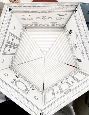
These Days
Barbara Tetenbaum
These Days’ is a hardcover, fabric-covered book that when opened is resemblant of a game board, around the border of the border are cut and pasted squares of paper with significant words that describe emotions and things that offer comfort. On the inside of the cover is an introduction that describes the effects of the consistent bombardment of bad news in the media on the author’s lifestyle, she compares her life to a board game, the onslaught of emotions counteracted with acts of self-care to offer herself comfort from the anxiety. A smaller pamphlet attached to the inside consists of collage work with different mediums of drawings, paint, photocopies, and images overlaid with news headlines that evoke anxiety and concern for our country
-

These Days
Barbara Tetenbaum
"These Days" is a hardcover book that, when opened, resembles a game board. Around the border are squares containing significant words that describe emotions and things that offer comfort. On the inside of the cover is an introduction that describes the effects of the consistent bombardment of bad news in the media on the author’s lifestyle; she compares her life to a board game, the onslaught of emotions counteracted with acts of self-care to offer herself comfort from the anxiety. A smaller pamphlet attached to the inside contains a collage of drawings, paint, photocopies, and images overlaid with news headlines that evoke anxiety and concern for our country.
"Life seems lived as a game, dodging the continual onslaught of bad news lobbed from every possible direction. My coping mechanisms have kept me from driving my car off the Fremont Bridge. I look for insight or laughter as I scan the internet for cozy pajamas to wear as I binge-watch ‘Cheers’ or ‘The Office’. I turn to astrology, psychic counseling, open random books searching for hope in everything. Before burying my head in the sand." — Barbara Tetenbaum
-

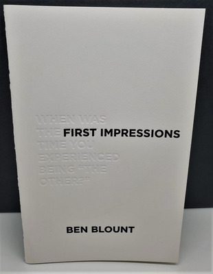
An Other Story
Ben Blount
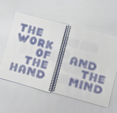
"This project originated from Blount’s powerful artists book 'First Impressions' in which he asked participants to recount the first time they felt othered. Blount put the same question to students in Rachel Simmons’ book arts class in spring 2021. The students responded through personal writing & bold imagery, then designed and printed folios on their provisional presses using metal type and other relief printmaking materials. Their folios addressed a range of personal experiences with feeling demeaned and marginalized—culturally, physically, socially. They responded to the prompt with honesty and courage. For almost every student in class, this was their first time working with letterpress, and they were inspired to take on that challenge by Blount’s bold use of typography in his work. Blount designed & printed the striking covers and Simmons did the colophon and assisted with assembling the edition of 20. The book is now part of the Rollins Book Arts Collection. This project was made possible by a grant from the Rollins College Thomas P. Johnson Visiting Artist & Scholar Program." - Rachel Simmons
-

Gina and Joe Talk About Queer Horror
Gina Brandoliho and Joe Carlough
In this zine, the authors explore the interconnected themes of horror and queerness. Drawing from personal anecdotes about experiencing horror movies during their youth and curating movie recommendations for Pride Month, Gina and Joe create a nuanced narrative. The intimate written content, complemented by black and white hand-drawn illustrations, offers a poignant and engaging exploration of complex themes.
