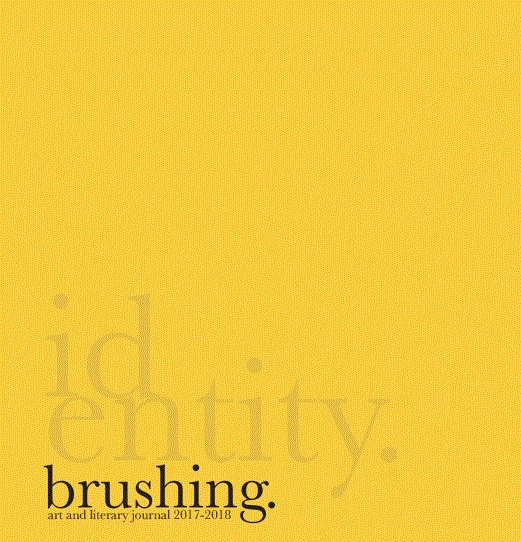
Volume 2 (2018) Identity
Editors' Note
As an annual journal, each issue of Brushing has the chance to capture the climate of the Rollins community for that year, immortalizing it in print. During our first meeting as co-editors of the journal, we realized that with our issue, we wanted to hone in on Brushing’s unique ability to document the community climate and explore what Rollins has been feeling this historic and uncertain year. When we sent out the call for submissions, we did not have a theme for the issue. We wanted to take an unfiltered snapshot of Rollins, and the submissions that we received—well over a hundred of them—formed a theme of their own. The pieces in the journal each offer a deep, introspective look into the self, despite the current obsession with external conflict and spectacle. This year, we are extremely pleased to present our issue of Brushing, based around the theme of identity. From the personal perspective of two graduating seniors, we are often faced with the questions of who have we been? Who are we? Who will we become? The answers are often hard to articulate, which is why we hope the following pieces, beautifully designed and organized in these major sections, can help guide the reader, as well as ourselves, to answering these difficult questions. Inspired by this year’s pieces, we hope to face the coming year with the audacity to challenge ourselves, overcome obstacles, try something new, and look at things from a different perspective. This year, we invite the reader to do the same. It has been a pleasure putting together this issue and working with our exceptionally talented team: our designer, writers, artists, editors, readers, and advisors. We hope you enjoy reading our issue of Brushing as much as we enjoyed creating it.
Sincerely,
Sianna Boschetti & Tyler Vaughan,Co-Editors-in-Chief
Articles
Editor's Note
Sianna Boschetti and Tyler Vaughan
Designer's Note
Anna Wenzel
My Childhood Began in the Trees
Kianna Dieudonne
Thoughts on Sounds
Edwin Davis
This, Too, Shall Pass
Michael Dulman
The Condition of the Zombie
Catharine Linder
Autumn Wind
Alex Litchner
Grass Shrimp
Gene Moore
The Greatest Lesson
Shelby Phillips
Never Dreamed
Marian Hernandez
Meat and Other Words for Kill
Edwin Davis
(such sanguineus anatomies)
Luc Lasman
Apollo and Daphne
Edwin Davis
I Was You and You Were Me, But I Didn't Know Very Much About That. All I Knew Was This.
Rachel Goldenberg
(Distance)
Kendall Clarke
Beneath the Bridge
Bet Tauscher
A Walk in the Shadow of the Woods
Leah Delisle
When They Go
Shumaita Kabir
Generators Speak
Kathy Kite
Heaven For Leo
Stephanie Macias
"Women" & "Beauty"
Ashley Chico
The Riddle of the Sphynx
Kendall Clarke
Desire Paths
Lea Warren
Everywhere
Elizabeth Trepanier
Oculus Videre
Jody Roun
Transference of Souls
Richard Reep
CYMERA_20171219_105436
Italia-Rico Hurtado
The Nutcracker Suite in Pastel
Noelle Wurst
Beatbox Emergency
Maisie Haney

Editors
- CO-EDITOR-IN-CHIEF
- Sianna Boschetti
- CO-EDITOR-IN-CHIEF
- Tyler Vaughan
- HEAD OF DESIGN
- Anna Wenzel
- EDITORS
- Alex Candage
- Bruno Sato De Oliveira
- Juan Diego Medrano
- Elizabeth Trepanier
- Kathy Kite
- Melissa Simon
- Caitlin Cherniak
- READERS
- Alex Candage
- Corrine Shoemaker
- Caitlin Cherniak
- Maisie Haney
- Grae Kipping
- Helena Cabrera
- Kathy Kite
- Alex Lichtner
- ADVISORS
- Greg Golden, Director of Student Media
- Matthew Forsythe, Faculty Advisor
Designer's Note
The design for the 2017-2018 issue of Brushing came, conceptually, from a number of different places. First and foremost, the content of the pieces themselves drove the design decisions, and each element was included with the intention of emphasizing the works themselves. With a concept as broad as “identity,” however, a clear direction was necessary. Given the primarily serious themes of this issue’s pieces, I wanted design elements that enhanced rather than distracted from the literature. I took inspiration from poetry publications, like Rupi Kaur’s Milk and Honey and The Sun and Her Flowers, as well as the clean but detailed designs of old anatomy textbooks. Finding a balance between detail and simplicity was difficult, especially for an illustrator accustomed to semi-realism and cartoons, like myself. To mediate my style, many of the graphics were done using a single line. With each drawing, I tried to get to the crux of the subject, only including what was absolutely necessary to convey the meaning of the piece. On a more technical level, the design of the book was, again, inspired by traditional poetry books. The font used is Baskerville, a simultaneously classic and modern typeface that is more visually interesting than the commonly-used Times New Roman, but is still recognizable and easy to read. The decision to divide the work into chapters was my own, and it was done with the hope of adding organization to the publication, and maybe to emphasize the meanings of certain pieces. Ultimately, each piece speaks for itself, and my designs exist mainly to decrease the amount of blank space in the final book. It is my hope that the reader can enjoy text and image, both separately, and as singular work of art.
Sincerely,
Anna Wenzel, Head of Design